
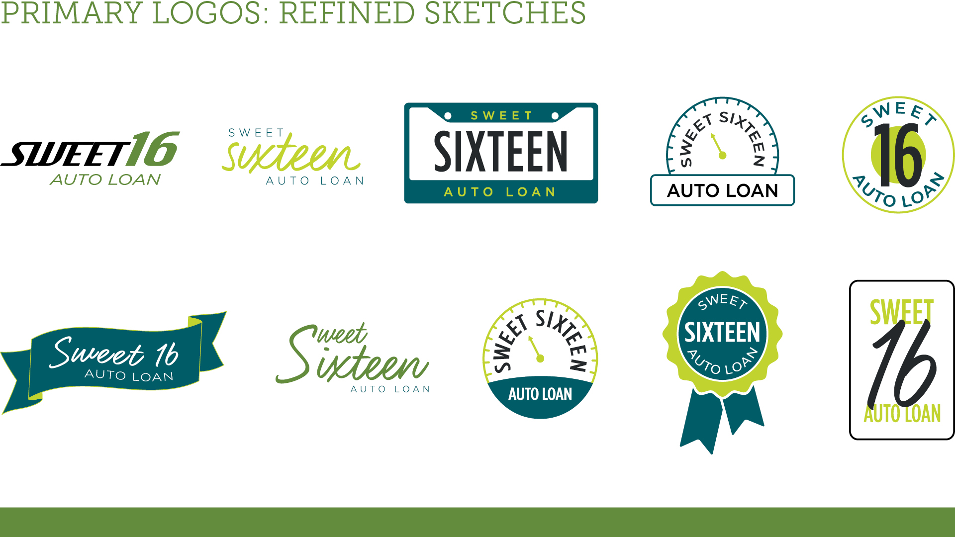
I led the end-to-end design for two new product logos under Seattle Credit Union: Cycle Loan and Sweet 16 Car Loan. The challenge was to create distinctive visual identities for each loan while staying aligned with SCU’s established brand system.
I approached this by designing two typographic logos—one inspired by a bicycle frame for Cycle Loan, and one resembling a license plate for Sweet 16. These subtle visual cues clearly communicate the purpose of each loan at a glance, while still feeling cohesive as part of the same product family. The goal was to ensure strong brand recognition even in fast-viewing environments like billboards or highway signage.
What I loved most about this project was the balance between creative freedom and brand consistency. There was an existing framework in place, which helped guide decisions, but I still had the space to build something fresh and meaningful.
From initial concepting and visual strategy to final logo execution and rollout assets, I was hands-on at every stage, making sure each product looked and felt just right.
Cycle Loan encourages eco-friendly transportation by helping cyclists invest in quality bikes.


Sweet 16 Loan is designed to support first-time car buyers—often teenagers and their families—while helping them establish credit early on.


Research, concept, execute, create mockups, create presentation deck, communicate with stakeholders
Creative Director: Mimi Lettunich
Account Manager: Brian Bauman