
I had the opportunity to work with a venture capital firm to build their brand identity from the ground up. The founder wanted an owl in the logo—something that could represent their mission of guiding startups toward success while staying creative and adaptable.
This project was such a fun challenge, especially when I landed on the idea of using an incomplete typeface to reflect the growth journey of startups—always evolving, always building. I added a 45-degree cut to the letterforms to give the logo more energy and strength, capturing that forward momentum.
For the owl, I went with a hand-sketched, intentionally unfinished style to symbolize continuous improvement—there’s always more to learn, always room to grow. The owl’s expression is focused and clear-eyed, representing determination and vision. And if you look closely, the eyes also double as wings—a small detail to reinforce the idea that this journey is about lifting others up and soaring together.
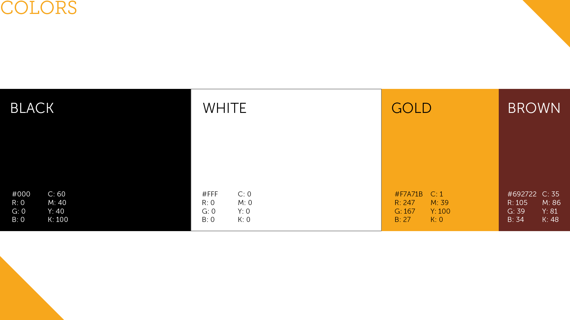
The client wanted to keep the palette mostly black and white, with just one or two accent colors to add personality. We chose gold and brown—gold to represent success and ambition, and brown for its grounded, stable feel. Together, they strike a balance between warmth and confidence, sending a clear message: we're welcoming, focused, and committed to success—no matter what.


My responsibilities:
Research, concept, execute, illustrations, layout, pitch deck, present and communicate with client