
My TOIBox (MTB)—with TOI standing for “Topics Of Interest”—is all about creating fun, personalized games and experiences around the things people love. Think predictions for family gatherings or custom games you can share with friends that turn everyday moments into something memorable.
For example, someone can send a Called It! template to their families to predict what will happen at the family gathering that's happening soon, like "My uncle will spill his food at least 3 times", or "My cousin will wear her signature neon green outfit again."
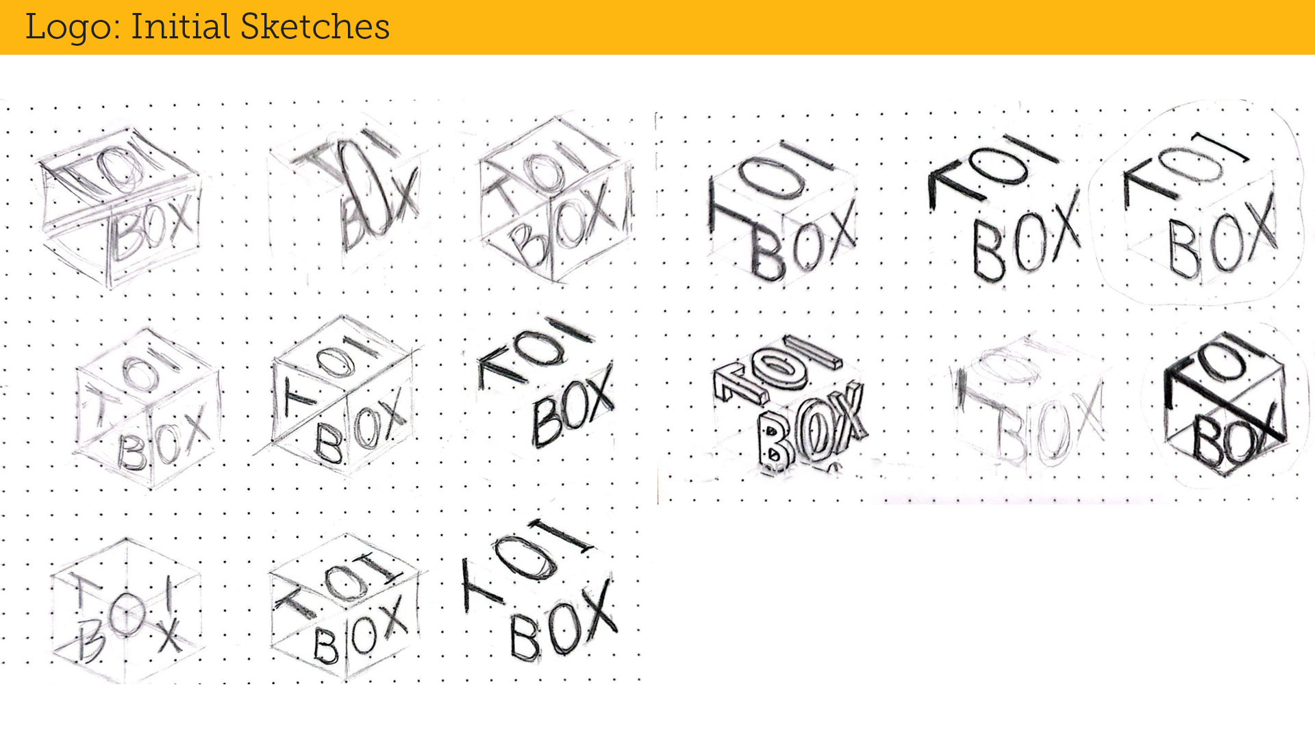
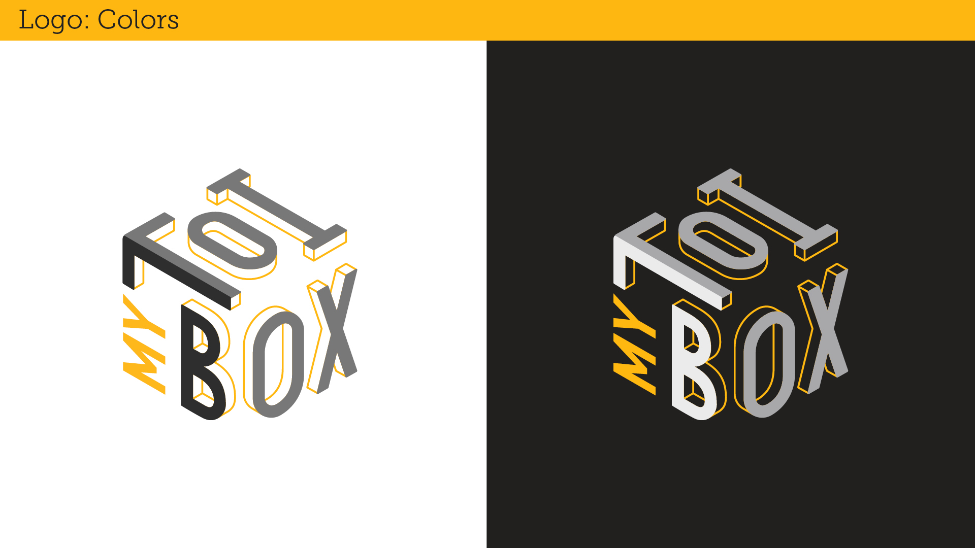
The whole platform is about self-expression, so I created a visual identity that reflects that. The logo is a hollow isometric box—representing a space users can fill however they like. It’s all about flexibility and imagination, with no boundaries on what someone’s “box” can hold.


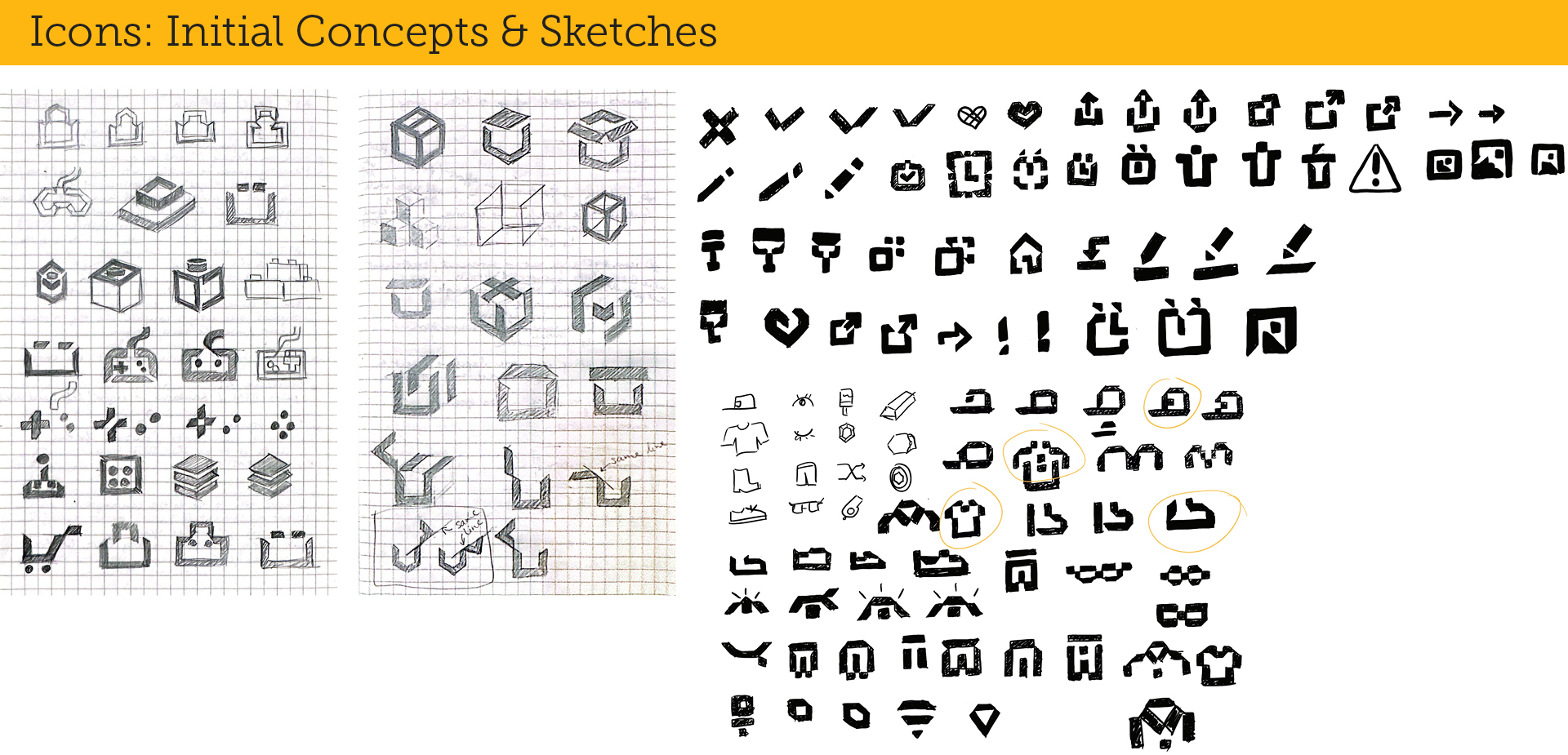
I wanted to design a bold and playful icon system to match the personality of the platform—versatile, legible, and full of energy.


The goal was to design a badge system that was scalable, easy to manage, and visually engaging—especially since users could earn over 80 badges across the site. There was also some issues that raised along with this badge system.
I started by creating a shape-based system where each badge category had its own unique shape, derived from our iconography. Each badge had three tiers, and the tier was represented by a different version of the shape, with custom content inside.


While this approach clearly showed both category and tier, it quickly became inefficient—especially at small sizes, where details got lost, and exporting every variation became time-consuming.
To improve legibility and speed things up, I made the category shapes secondary graphics layered behind the main badge content. The tiers were shown by how many shapes surrounded the core graphic—no shapes for tier 1, a couple for tier 2, more for tier 3.


This made the badge icon more readable and visually impactful, but still didn’t fully solve the issue of production time and complexity.
Finally, after user testing and conversations with the dev team, we simplified the system completely. We learned users didn’t really care about categories—they just wanted to know which badge they earned and what level they were at. So we shifted to a single distinct graphic per badge that "leveled up" as users progressed: Newbie → Advanced → Expert. Special badges earned once start at the Expert level.

This final solution was simple, visually clear, and much easier to maintain.

From game graphics to infographics, I had a blast bringing all these moments to life across the platform.
This sub-brand adds a fun twist to MTB’s fantasy sports feature. After picking your lineup, you choose a “Wild Card” that can boost or reduce your players' or your opponents' points, totally shaking up the game.


The logo features two arrows pointing up and down, using juxtaposition to subtly suggest the shape of a card and reflect the unpredictable, high-stakes nature of the feature.

Stay Golden is a feel-good part of the platform focused on lifestyle and personal growth. Its main goal is to help people find information about what they need for themselves (health, fashion, self-care, education, etc.) to improve their own needs, to make them grow as their own golden self.


I created a warm, handwritten-style logo with a filled-in “o” to symbolize something precious inside each person. It's all about helping users grow into their most “golden” selves.

I also customized the typefaces so when it is used with the MTB logo, it will follow the angles of the MTB logo harmoniously.
This section helps users earn real rewards—whether it's selling pre-loved items or joining sponsored games.


The logo uses a slanted, glitchy type to express movement, energy, and digital hustle vibes. It’s always on the move—just like the people using it.
Research, concept, ideate, execute, art direction, lead graphic team, assets, collaborate with other teams (developer, UX, animation, marketing, director, managers), create pitch decks, communicate with stake holders, mentor junior designers
Creative Directors: Mimi Lettunich, Steve Shaw
Associate Creative Director: Corey Wills
Graphic Team: Sarah Bounds, Quin Henriksen, Malorie Wheeler
UX Designer: Quy Ho
Marketing: Ian Wagner
Developers: Isabelle Barter and team
3D Designers: Michael Hewitt, Syrrah Lee